Ok, so on the new batch, I don't like #3 because the Title abomination blends in too much and is hard to read. #2 is a bit too murky feeling. I lean towards #4 or #1. Like others said, I'm not a fan of the red in the title. I'd say either 1 or 4 out of the existing batch, but #3 might be awesome if you change the font color on the title to make it more readable.
HERE COMES A NEW CHALLENGER!
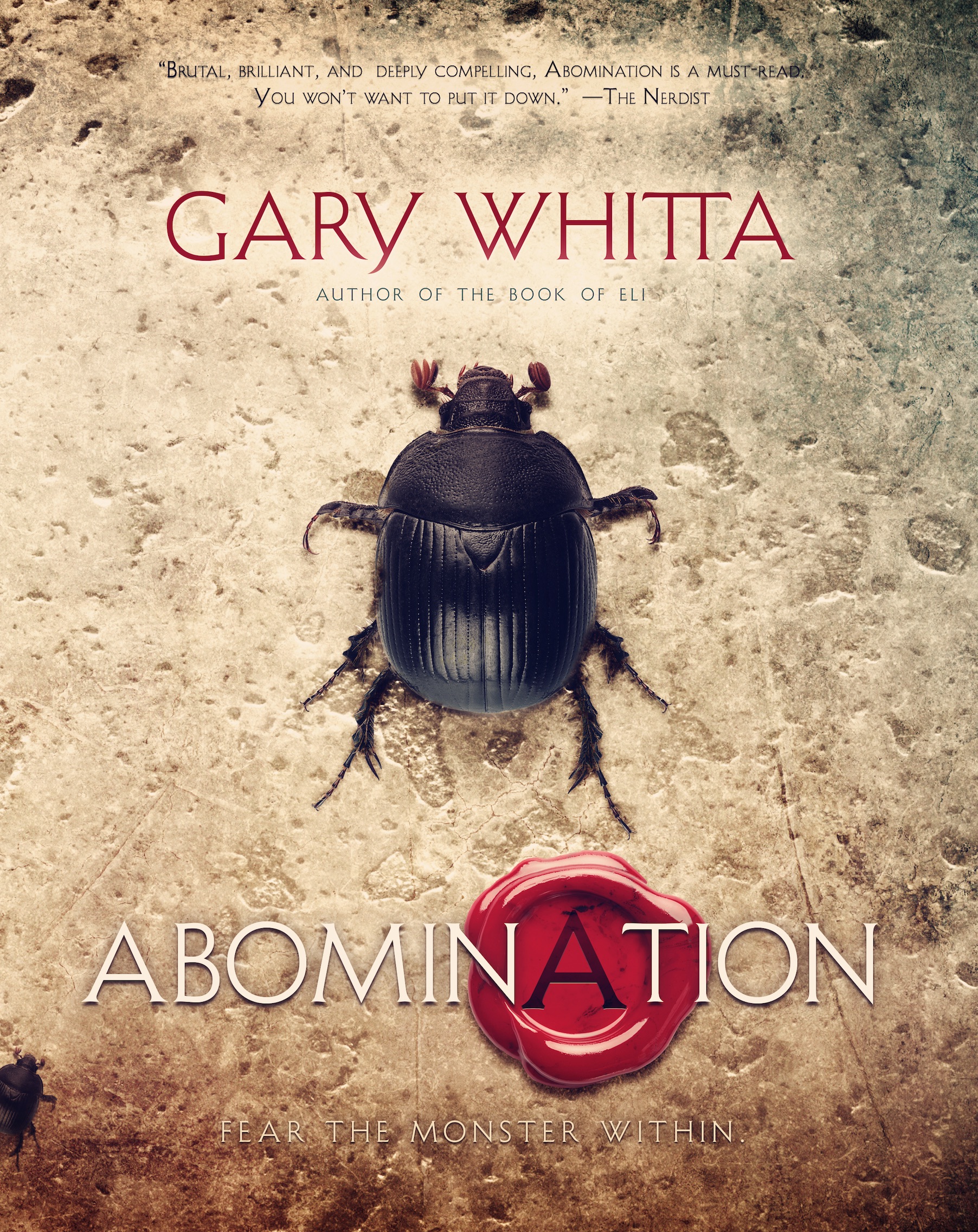
A new rough concept just came in from Jason. What do you guys think of this one?
I'd say the new cover design wins. After that I vote 1, then 3


Beetle cover wins in my book. But, if I had to pick a runner up it would be #1.