One-part writer, one-part screenwriter, all-parts more than likely to geek out with you.
I think I would have to say the top one personally.
The bottom one reminds me of the "teal and orange" movie poster mockery going around, but people use teal and orange because they look really good together. I think I like the bottom one better because it helps my eye see the difference between the top and bottom scenes better.
Maybe mess with it a bit like Christine recommended?
One-part writer, one-part screenwriter, all-parts more than likely to geek out with you.
I like the Blue one. I’d like the Brown one better if it was subtler or perhaps just a darker shade of brown.
Brown seems like the logical choice, but I’m leaning towards blue.
I agree. I’d go with the brown.
I like the lower one. The contrast makes for more interest.
Dear fellow Inksharians - we’re stuck between these two choices for our cover - your input would be greatly appreciated. Quite simply,
BLUE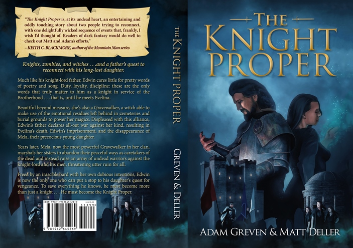
or
BROWN?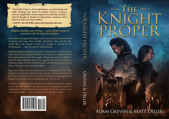
One-part writer, one-part screenwriter, all-parts more than likely to geek out with you.


