Thad Woodman
·
Inksharesian
·
added over 11 years ago
Thad Woodman
·
Inksharesian
·
added over 11 years ago
I'm loving #4
Thad Woodman
·
Inksharesian
·
added over 11 years ago
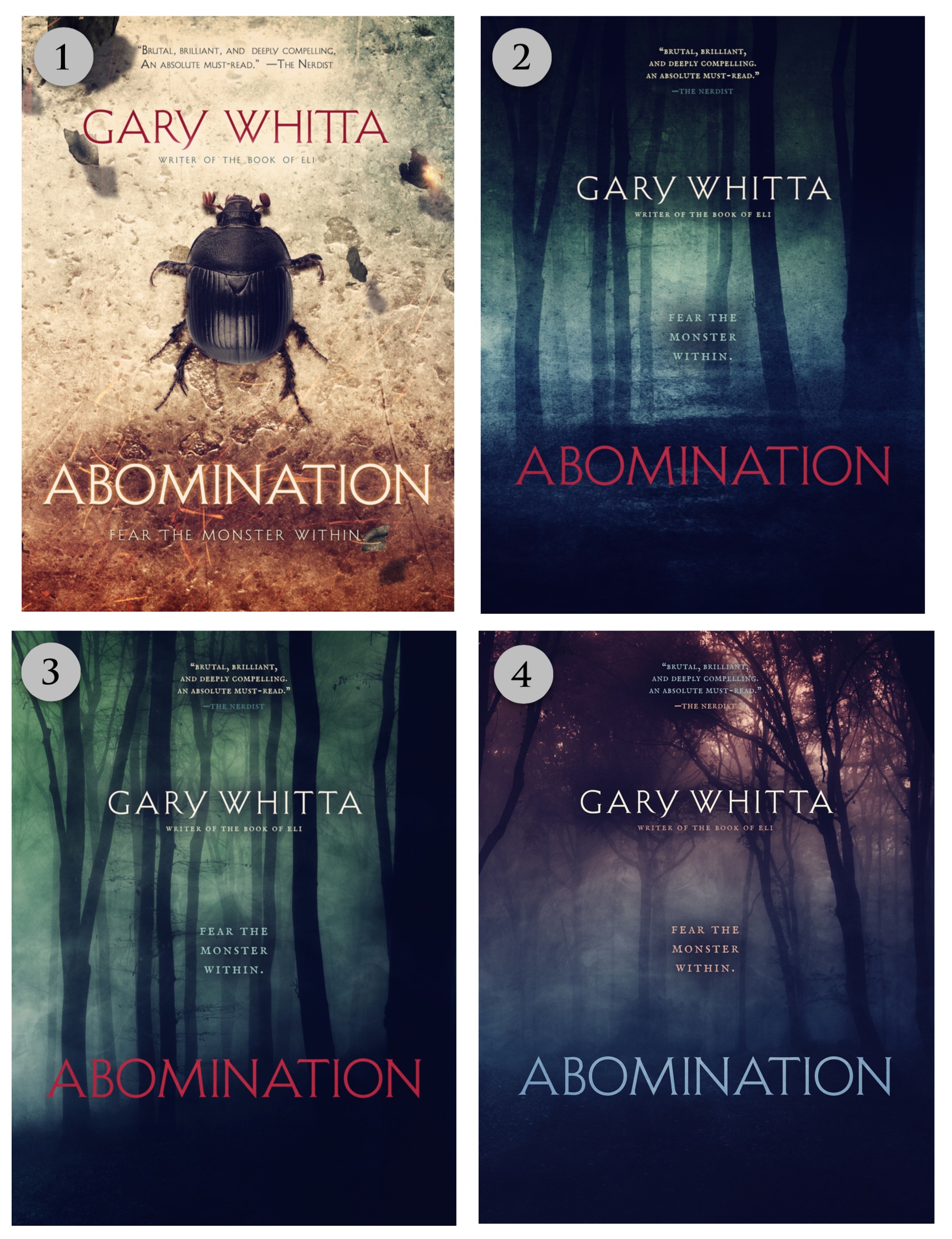
Hello reading people!
I have some more covers for you to look at and comment on! To those of you who pointed out that the wax seal on the earlier "beetle" cover made it look too much like The Secret - THANKS A LOT I CAN NOW NEVER UNSEE THAT. So the wax seal is GONE but the beetle concept remains in contention because I like it. You'll see the latest version of that here. I also asked Jason to work up some more variations on the "creepy forest" concept, which you'll see here. I really like the idea of a cover that is vague and atmospheric and suggestive of a general mood rather than showing anything too specific. As always let me know what you think!